E everyone doesn’t experience the web the same way due to one reason or the other. The concept of digital accessibility is founded on the idea that everyone, including people with disabilities, should have equal access to information on the web. For example, while a non-disabled person will interpret text and images based on what they see, another user will use assistive technology (such as a screen reader) to understand the same content. As a bonus, when accessible, web content can also be useful for anyone who wants to listen to the web content while multitasking.
🔗 See these examples of ADA-compliant websites
Accessible digital content does not only refer to content on websites or apps. It covers emails and documents that are shared digitally, such as Portal Document Formats (PDF). An accessible email will have descriptive link text, good heading structure, and sufficient color contrast between text and background without communicating information through color alone. It is common for document accessibility to be overlooked; meanwhile, they contribute to part of your web content that needs to be accessible to the disabled and compliant with digital accessibility laws.
As the most widely used document format, PDF use continues to grow every year. Together with forms, they are now a common requirement for doing business and the predominant format for digital documents, such as job applications, among other uses, thanks to their versatility and straightforwardness. Hence, the necessity to ensure its accessibility to everyone, including screen readers or assistive technology users. Failure to make them accessible creates a legal liability for your organization under some digital accessibility laws.
❗See examples of greatest accessibility fails (don’t do this!)
As for HTML content of websites, PDF documents can be made accessible and 100% in compliance with international accessibility standards such as the Web Content Accessibility Guidelines (WCAG) and Section 508, etc. The World Wide Web Consortium (W3C) provides technical documents – PDF Techniques for WCAG 2.1 as a set of guidelines for creating more accessible PDF, which has become the ISO Standard – PDF/UA (ISO 14289-1:2014).
So what are the rudiments of document accessibility you must ensure?
Proper tagging of PDFs
This is probably the most significant issue on document accessibility. Ideally, PDF files need to have tags assigned to be “read” by a screen reader. An untagged PDF is by default not accessible and won’t work with assistive technology. PDF tags include headings (e.g. <H1>, <H2>), tables (<Table>), and images (<FIGURE>). H1 should always be the main heading and then flow through to H2 for the first level of sub-headings while H3 is for smaller topics within the subtopics and so on down the line.
Alternative text
Like how images on websites and apps need to have alternative text (alt-text) to help relay the message the image is passing and the purpose, images in PDFs must have alternative text descriptions to ensure they can be picked up and understandable to assistive technology users.
| Bad (ALT text: A rooster) | Good (ALT text: Red-crested rooster crowing) |
|---|---|
 |
|
Tag structure
The addition of tags does not automatically make a PDF accessible. Tags enable screen readers to interpret the structure of the document. Still, they need to be verified to correctly identify the page elements and ensure that the reading order is correct. Proper tag structure represents a pathway to full compliance with standards.
Make use of lists
Like how headings enable assistive technology users to understand how the page is organized and quickly navigate to content that is of interest, lists also help screen readers understand how the content is organized.
All content organized as a list should be created using list controls so that when screen reader users enter a list, the assistive technology picks it up and informs them that they’re on a list and other information that can help them decide whether to continue reading.
Table headers
Like headings and images, tables need to be appropriately tagged to ensure they can work with screen readers. Correctly tagged table headers ensure they can be navigated and read in the correct order by assistive technology such that header and data cells can be identified.
Write in plain language
Just like website content needs to be presented in a simple layout without losing information or structure, documents also need to have clear language and a correct reading sequence to communicate effectively, especially to assistive technology users. Avoid jargon, acronyms, and abbreviations, and use plain language that the reader or listener can easily understand. Instead, use very short sentences and bullet points to break down complex information.
Use meaningful hyperlinks
Meaningful hyperlinks are essential for all users in general. When formatting a hyperlink, ensure the purpose of each link can be determined from the link text alone. The hyperlink should describe the item e.g., instead of “click here”, use click here to see our WCAG 2.0/2.1 checklist”.
| Bad (the purpose of the link cannot be determined from the link text) | Good (the purpose of the link can be determined from the link text) |
|---|---|
 |
 |
Presentation and layout
A good presentation helps the reading and comprehension of documents. Like in web design, ensure to use a clear font without many flourishes. Thin or light fonts might be problematic for dyslexic users and those with visual impairments, while heavier fonts are generally easier to read.
Also, do not overcrowd the page with text, and ensure sufficient space between paragraphs and between lines. More so, don’t use color alone to convey information or meaning.
Identify document language
It is usual for screen reader software to be multilingual and read web content in English, French, or any other language. Hence, it is essential to identify the document’s language to ensure screen readers read the document in the appropriate language profile.
Similarly, it is crucial to identify the language of any other content written in a language that is not the document’s default language. This is also to ensure screen readers can pick the new language without confusing the reader or listener.
Media
Part of document accessibility is to ensure any embedded audio or video files contain applicable closed captioning, transcripts, etc., to ensure individuals with low or no hearing ability have alternative ways of accessing the content.
Use of color
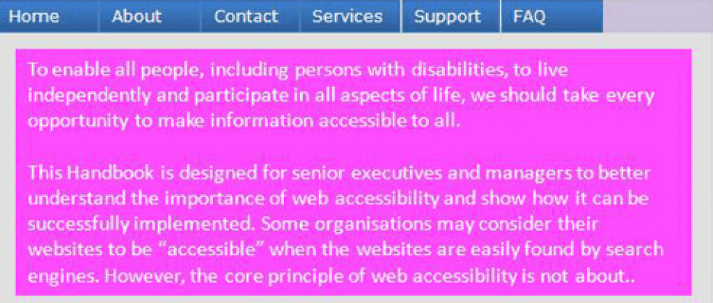
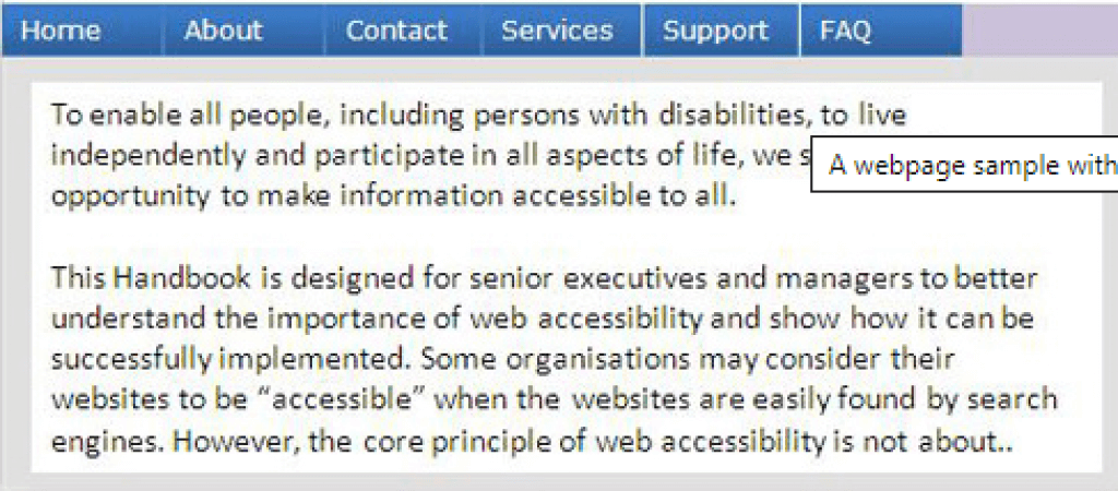
High contrast makes documents more legible as it helps increase readability for users with visual impairments. The strong color contrast between the foreground and the document background is beneficial to readers with dyslexia or learning difficulties. WCAG specification recommends a contrast ratio of at least 4.5:1 for normal text and at least 3:1 for large-scale visual presentation.
| Bad (poor contrast) | Good (good contrast) |
|---|---|
 |
 |
Accessible Documents for Compliance
Providing equal access to information through disabled access is just good business. This covers all public-facing websites and apps that the organization controls. In the quest to validate an organization’s overall digital accessibility, one must, however, not forget to make digital documents (including presentations and spreadsheets) accessible.