Create an accessible design and make web content accessible to people of all abilities, including people with disabilities. More so, following this accessibility checklist will keep you compliant with ADA, Section 508, EN 301 549, and BITV 2.0 among other international digital accessibility laws.
STOP! Your website is not accessible? See ADA-compliant website examples
WCAG 2.1/2.0 (Level A, AA, and AAA) Guidelines
Web Content Accessibility Guidelines (WCAG) 2.0 and WCAG 2.1 is a specification of internationally recognized guidelines that covers a wide range of recommendations for making Web content more accessible.
These guidelines are organized under 4 principles, also known as POUR;
- Perceivable
- Operable
- Understandable
- Robust
For each guideline, testable success criteria are provided to allow WCAG to be used where requirements and conformance testing are necessary such as in design specification, purchasing, regulation, and contractual agreements. In order to meet the needs of different groups and different situations, three levels of conformance are defined: A (lowest), AA, and AAA (highest).
Perceivable
Information and user interface components must be presentable to users in ways they can perceive.
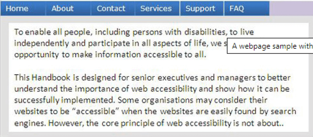
Guideline 1.1 Text Alternatives
(Level A)
Provide text alternatives for any non-text content and should serve the equivalent purpose.
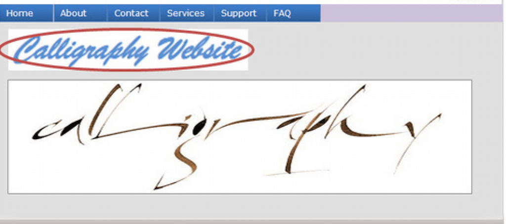
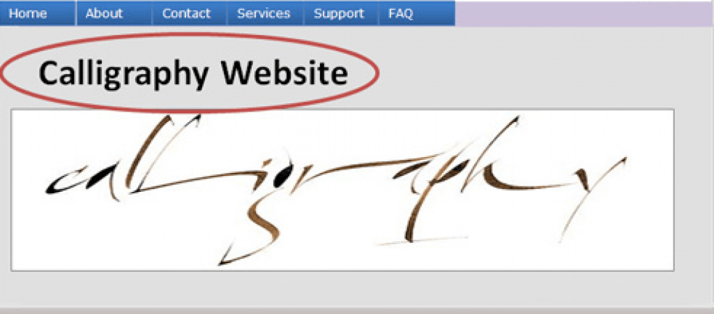
| Bad (ALT text: A man) | Good (ALT text: Barack Obama – Former U.S President) |
|---|---|
 |
|
Guideline 1.2 Time-based Media
Provide alternatives for time-based media.
(Level A)
- Provide an alternative for time-based media that presents equivalent information for prerecorded audio-only or video-only content.
- Provide an alternative for time-based media for synchronized media.
- Provide captions for all prerecorded audio content in synchronized media.
| Bad (no caption provided for deaf users who can’t hear) | Good (synchronized captions are provided) |
|---|---|
 |
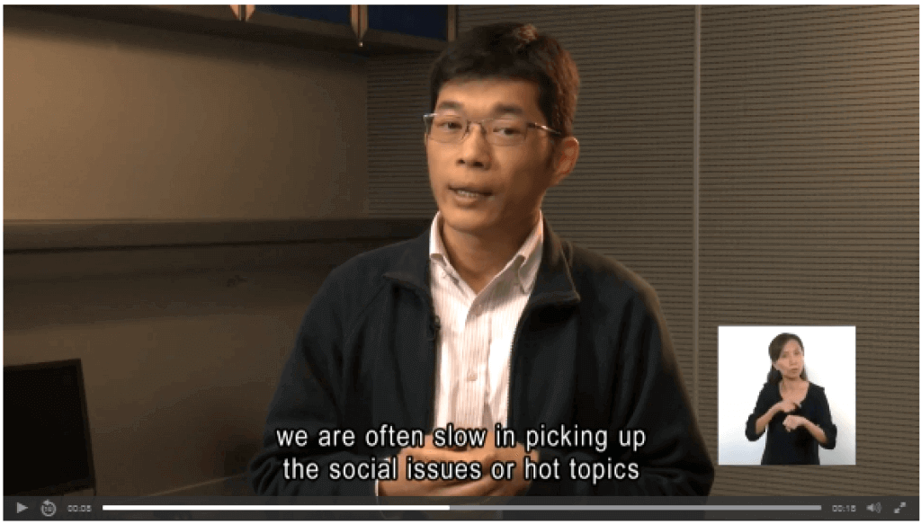 |
(Level AA)
- Provide captions for all live audio content in synchronized media.
- Provide an audio description for all prerecorded video content in synchronized media.
| Bad (no caption for audio content) | Good (caption is provided for audio content) |
|---|---|
 |
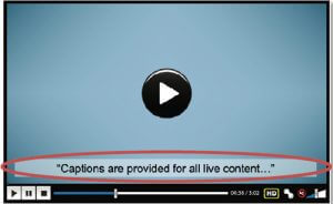 |
(Level AAA)
- Provide sign language interpretation for all prerecorded audio content in synchronized media.
- Provide an extended audio description for all prerecorded video content in synchronized media when audio descriptions can’t convey the sense of the video.
- Provide an alternative to time-based media for all prerecorded video-only media.
- Provide an alternative for time-based media that presents equivalent information for live audio-only content.
| Bad (captions may not be enough for some users) | Good (sign language is provided) |
|---|---|
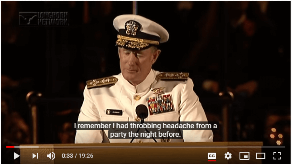 |
 |
Create content that can be presented in different ways (e.g. simpler layout) without losing information or structure.
(Level A)
- Ensure information conveyed through presentation can be programmatically determined or is available in text.
- Ensure a correct reading sequence can be programmatically determined.
- Instructions provided for operating content should not rely solely on shape or sound.
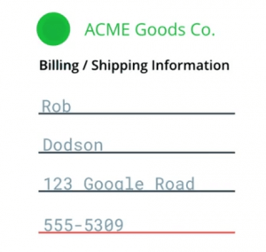
| Bad (reading sequence of the page cannot be read by a screen reader) | Good (reading sequence of form can be programmatically determined by a screen reader) |
|---|---|
 |
 |
(Level AA)
- Don’t restrict content view and operation to a single display orientation (portrait or landscape), unless a specific display orientation is essential.
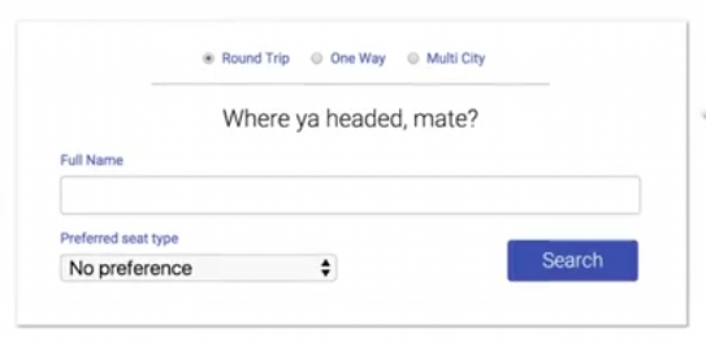
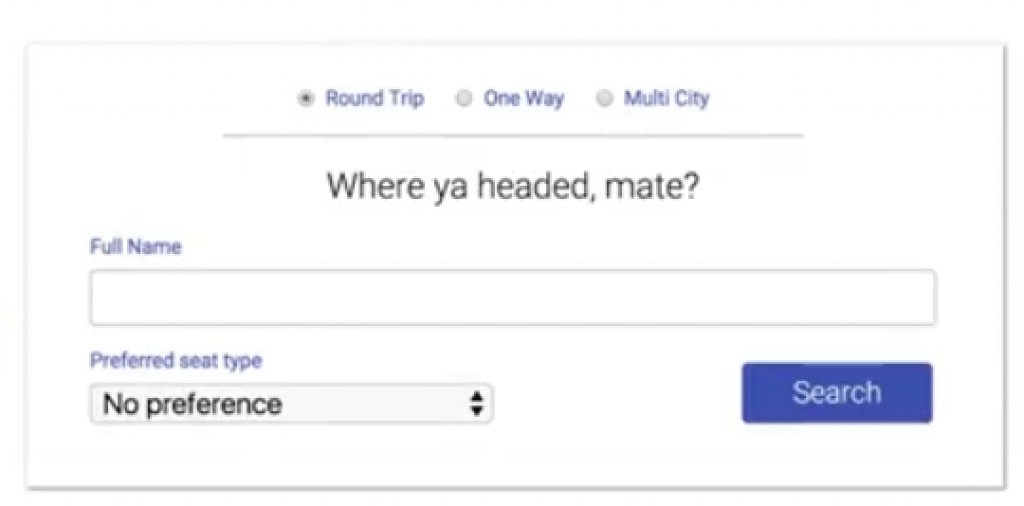
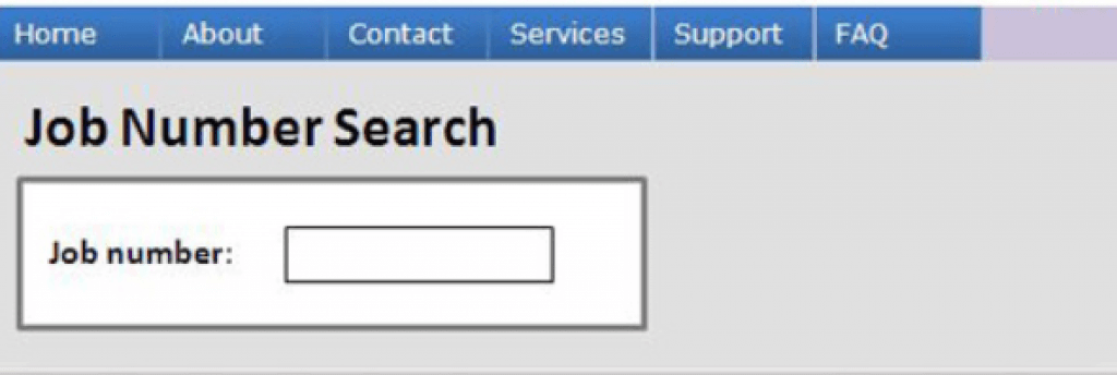
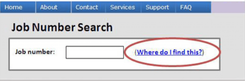
- The purpose of each input field is to collect information about the user should be easily identifiable.
| Bad (the content view is restricted to a single orientation) | Good (content can be viewed in a different orientation) |
|---|---|
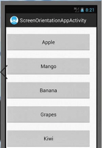 |
 content can be viewed in a different orientation |
(Level AAA)
- Ensure the purpose of User Interface components, icons, and regions can be programmatically determined
| Bad (screen reader can’t determine form requirements) | Good (screen reader can determine the purpose of the form) |
|---|---|
 |
 |
Content should be easy for users to see and hear. More so, separate foreground from background.
(Level A)
- Color should not be used as the only visual means of conveying information.
Provide a mechanism for controlling audio volume independently from the overall system volume level for any audio on the web page.
| Bad (relying on color alone to show error) | Good (using color and message to convey information) |
|---|---|
 |
 |
(Level AA)
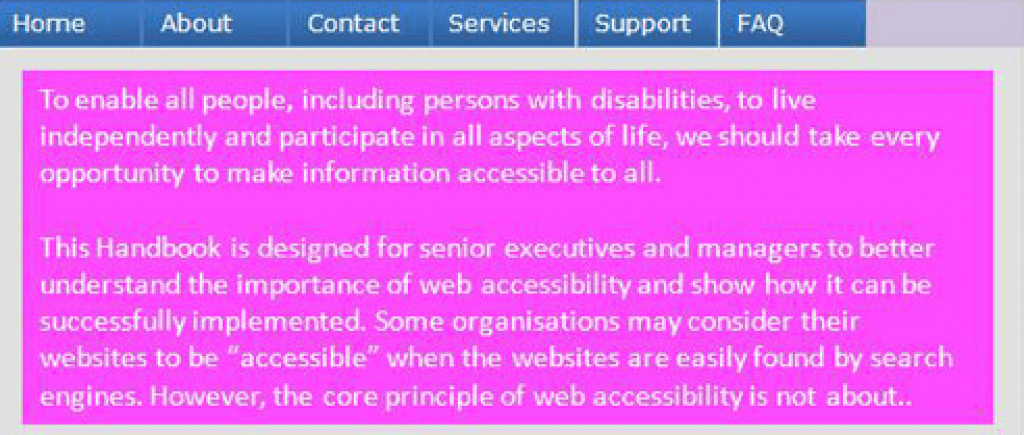
- The contrast ratio should be at least 4.5:1 for normal text and at least 3:1 for large-scale visual presentation.
- Ensure text can be resized without assistive technology up to 200 percent without loss of content or functionality.
- Convey information through text rather than images of text if the technologies being used can achieve the visual presentation.
- Ensure content can be presented without loss of information or functionality, and without horizontally and vertically scrolling.
- The contrast ratio should be 3:1 for User Interface components and graphical objects in visual presentation.
- Ensure no loss of content or functionality occurs by changing style property e.g. spacing.
- Where keyboard focus triggers additional content to become visible and then hidden, provide a mechanism to dismiss the additional content.
| Bad (web page with poor contrast) | Good (good contrast) |
|---|---|
 |
 |
(Level AAA)
- The contrast ratio should be at least 7:1 for text and images of text and 4.5:1 for large text in visual presentation.
- Ensure audio contains very low or no background sounds.
- For the visual presentation of blocks of text, provide a mechanism for selecting styling and spacing of the text.
- Images of text should only be used for decoration or conveying essential information.
| Bad (image of text is used to convey content) | Good (information is presented with text alone) |
|---|---|
 |
 |
Operable
User interface components and navigation must be operable.
Guideline 2.1 Keyboard Accessible
Make all functionality available from a keyboard.
(Level A)
- Ensure all functionality of the content is operable through a keyboard interface, except where the function requires input that depends on the user’s movement.
- Ensure focus can be moved to and away from a component of the page using a keyboard interface.
- Provide a mechanism for on and off-keyboard shortcuts implemented in content.
| Bad (web content can’t be operated by a keyboard alone) | Good (this web page can easily be operated by the keyboard alone) |
|---|---|
 |
 |
Level AAA)
- Ensure all functionality of the content is operable through a keyboard interface without requiring specific timings for individual keystrokes.
Provide users enough time to read and use the content.
(Level A)
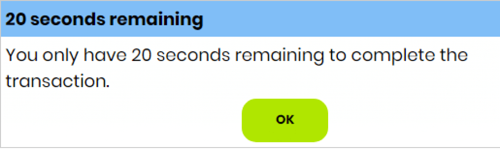
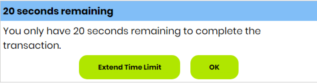
- Ensure that users can complete tasks without unexpected changes in content or context that are a result of a time limit.
- For moving, blinking, scrolling, or auto-updating information, ensure there is a mechanism for the user to pause, stop, hide the movement, or control the frequency of the update.
| Bad (web page does not allow the user to extend the time limit) | Good (web page allows for the extension of the time limit) |
|---|---|
 |
 |
(Level AAA)
- Ensure timing is not an essential part of the event or activity presented by the content, except for non-interactive audio/video.
- Ensure interruptions can be postponed or suppressed by the user, except for interruptions involving an emergency.
- When an authenticated session expires, ensure the user can continue without loss of data.
- Ensure users are warned of the duration of any user inactivity that could cause data loss except data is preserved for more than 20 hours.
| Bad (interruptions cannot be suppressed by the user) | Good (interruptions can be postponed) |
|---|---|
 |
 |
Guideline 2.3 Seizures and Physical Reactions
Do not design content in a way that is known to cause seizures or physical reactions.
(Level A)
- Web pages must not contain anything that flashes more than three times in any one-second period. Flash must not be below the general flash thresholds.
| Bad (image flashes more than three times in a second) | Good (image only flashes three times per second and flashing content is sufficiently small) |
|---|---|
 |
 |
(Level AAA)
- Ensure web pages do not contain anything that flashes more than three times in any one-second period.
- Ensure motion animation triggered by interaction can be disabled unless the animation is essential to the information being conveyed.
Provide ways to help users navigate, find content, and determine where they are.
(Level A)
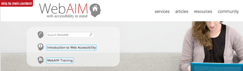
- Provide a mechanism to bypass blocks of repetitive content on a Web page.
- Ensure Web pages have titles that describe the topic or purpose.
- Ensure focusable components receive focus in an order that preserves meaning and operability.
- Ensure the purpose of each link can be determined from the link text alone or from the link text and the link context.
| Bad (a web page with many repetitive links) | Good (a web page with a bar for skipping repetitive links – skip to main content) |
|---|---|
 |
 |
(Level AA)
- Ensure more than one way is available to locate a Web page within a set of Web pages except the Web Page is a step in a process.
- Ensure headings and labels describe the topic or purpose.
- The keyboard-operable user interface should have a mode of operation where the keyboard focus indicator is visible.
| Bad (keyboard focus indicator is not visible) | Good (keyboard focus indicator is visible) |
|---|---|
 |
 |
(Level AAA)
- Ensure information about the user’s location within a set of Web pages is available.
- Provide a mechanism to allow the purpose of each link to be identified from the link text alone.
- Section headings should be used to organize the content.
| Bad (the purpose of the link cannot be determined from the link text) | Good (the purpose of the link can be determined from the link text) |
|---|---|
 |
 |
Guideline 2.5 Input Modalities
Make it easier for users to operate functionality through various inputs beyond the keyboard.
(Level A)
- Ensure all functionality that uses multipoint for operation can be operated with a single pointer.
- For functionality that can be operated using a single pointer, provide a mechanism to abort the function before or after completion.
- For user interface components with labels such as text, have the text of the label at the start of the name.
- Ensure user interface components can also operate functionality operated by device motion or user motion.
| Bad (the accessible name for the search component doesn’t include visible text) | Good (the accessible name for the search component includes visible text) |
|---|---|
 |
 |
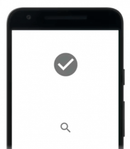
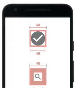
(Level AAA)
- Ensure the size of the target for pointer inputs is at least 44 by 44 CSS pixels except when in a sentence or block of text.
- Ensure web content does not restrict the use of input modalities available on a platform except where the restriction is essential.
| Bad (target size too small) | Good (paddings have been added to the target size and are now more visible) |
|---|---|
 |
 |
Understandable
Information and the operation of user interface must be understandable.
Make text content readable and understandable.
(Level A)
Ensure the default human language of each Web page can be programmatically determined using the HTML lang attribute.
| Bad (code won’t allow screen readers to determine the language) | Good (screen readers can determine the language) |
|---|---|
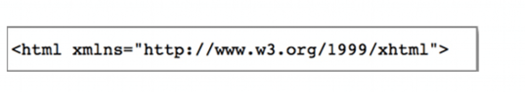 |
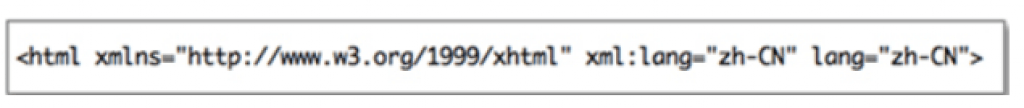 |
(Level AA)
- Ensure the human language of each passage or phrase in the content can be programmatically determined except for technical terms and vernacular.
| Bad (code with no clue about the use of multiple languages) | Good (code with a language tag attribute to help the screen reader identify it) |
|---|---|
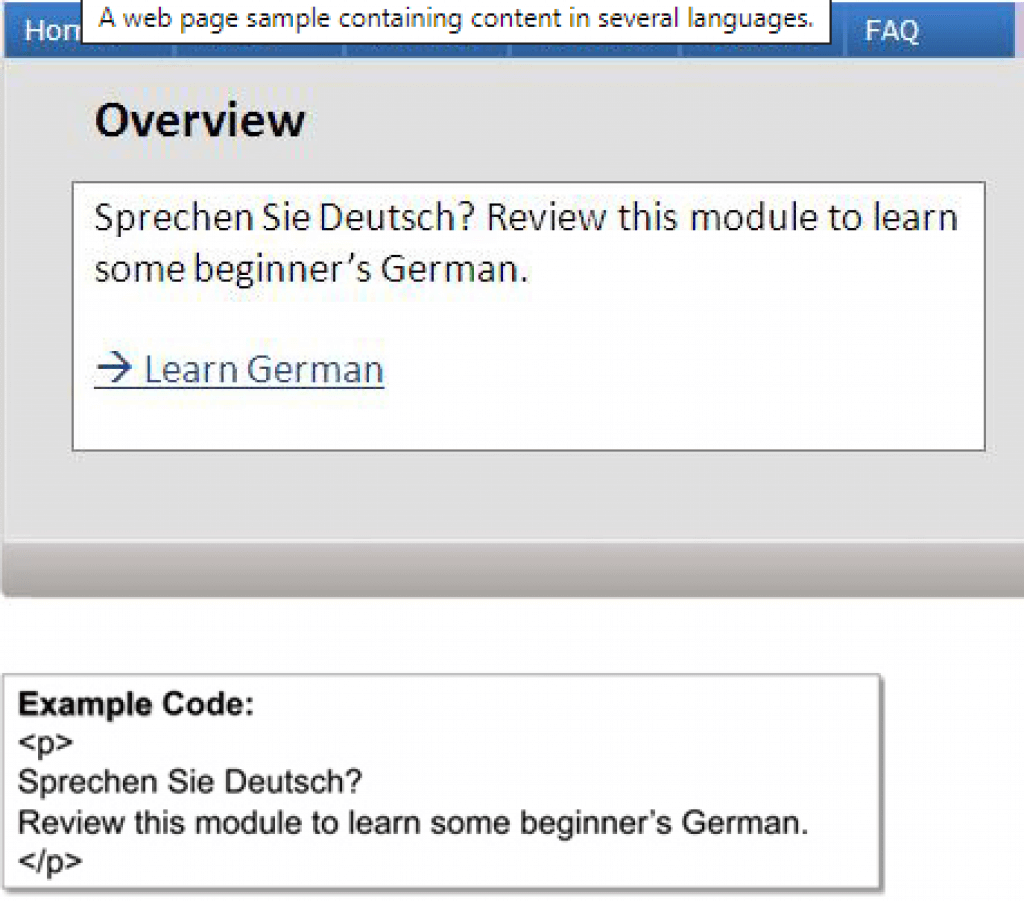 |
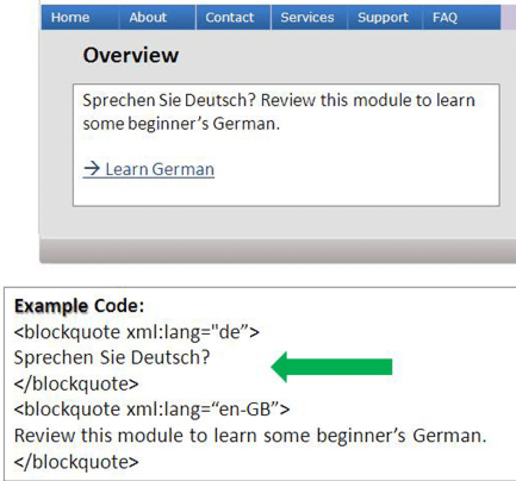 |
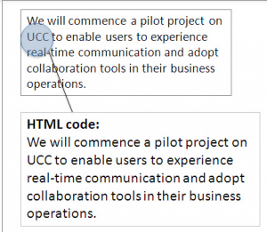
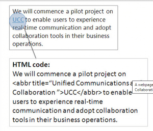
(Level AAA)
- Provide a mechanism for identifying specific definitions of words used in an unusual way, including idioms and jargon.
- Provide a mechanism for identifying the expanded form or meaning of abbreviations.
- Provide supplemental content text when the text requires reading ability more advanced than the lower secondary education level.
- Provide a mechanism for identifying specific pronunciation of words whose meaning, in context, is ambiguous.
| Bad (screen reader will only read the letters of the acronym and it won’t be understandable) | Good (screen reader will read the full version of the abbreviation in the web page) |
|---|---|
 |
 |
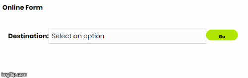
Make Web pages appear and operate in predictable ways.
(Level A)
- Ensure no user interface component initiates a change of context when it receives focus.
- Changes made to the settings of any user interface component must not cause a change of context unless the user has been warned before using the component.
| Bad (selected option will be submitted automatically without function confirmation) | Good (allows users to control when to submit the selection) |
|---|---|
 |
 |
(Level AA)
- Ensure navigational mechanisms that are repeated on multiple Web pages occur in the same relative order unless a change is initiated by the user.
- Ensure components that have the same functionality within a set of Web pages are identified consistently.
| Bad (component has the same functionality but they are not identified consistently) | Good (components serve the same function and are identified consistently) |
|---|---|
 |
 |
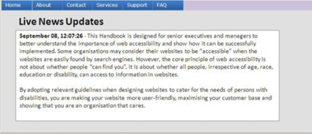
(Level AAA)
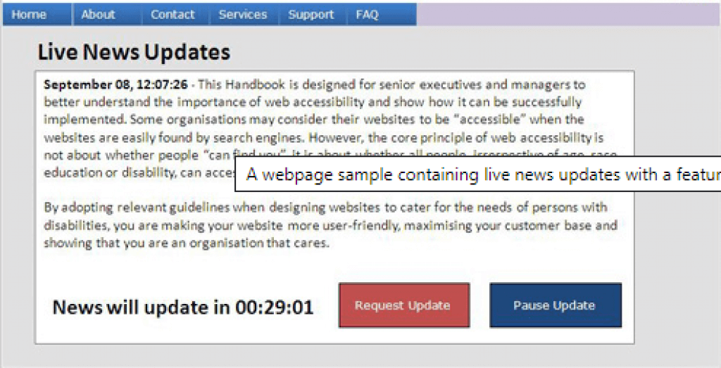
- Ensure changes of context are initiated only by user request and can be turned off.
| Bad (users may not have enough time to read all the news items before the automatic update) | Good (functions are available for users to control automated change) |
|---|---|
 |
 |
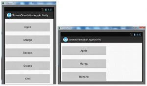
Guideline 3.3 Input Assistance
Help users avoid and correct mistakes.
(Level A)
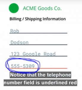
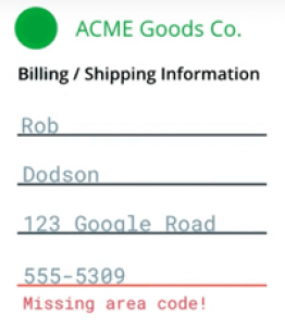
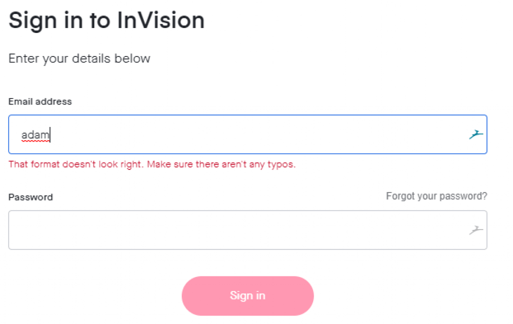
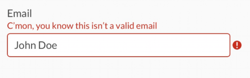
- Input error should be identified and described in the text to the user when automatically detected.
- Provide labels or instructions when content requires user input.
| Bad (input error is identified but not described to the user) | Good (input error described to the user in the text) |
|---|---|
 |
 |
(Level AA)
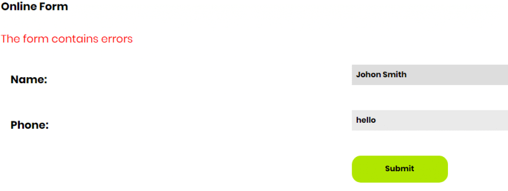
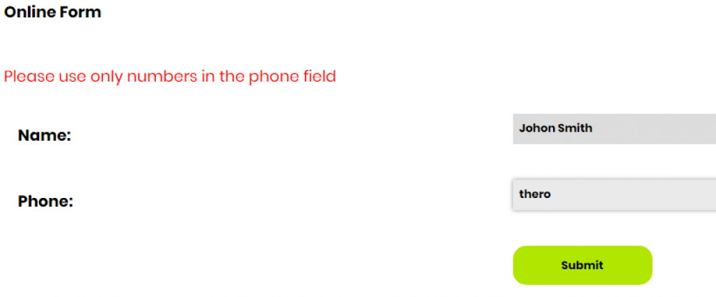
- If an input error is automatically detected and suggestions for correction are known, then it should be provided to the user.
- Provide a mechanism for confirming and correcting information before finalizing the submission for Web pages that cause legal commitments or financial transactions.
| Bad (error message without much helpful information is shown) | Good (a meaningful error message is included to help users better understand how the error can be fixed) |
|---|---|
 |
 |
(Level AAA)
- Ensure context-sensitive help is available.
- For Web pages that require the user to submit information, provide a mechanism for confirming and correcting information before finalizing the submission.
| Bad (cues are not provided in context to help the user complete and submit the form) | Good (cues are provided in context to help the user complete and submit the form) |
|---|---|
 |
 |
Robust
Content must be robust enough that it can be interpreted by a wide variety of user agents, including assistive technologies.
Maximize compatibility with current and future user agents, including assistive technologies.
(Level A)
- For content implemented using markup languages, ensure all elements are unique, except where the specifications allow it.
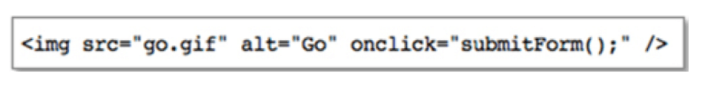
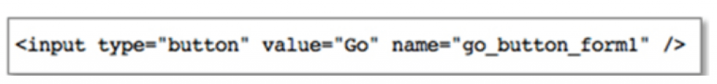
- For all user interface components such as form and elements links, a user should be able to programmatically determine the name and role; and also programmatically set the states and values.
| Bad (wrong HTML coding – an image is used for a button) | Good (correct HTML coding – input element is used for a button) |
|---|---|
 |
 |
(Level AA)
Ensure status messages can be programmatically determined through roles or properties and presented to the user by assistive technologies without receiving focus.
| Bad (status message is not announced to screen reader users) | Good (status message is presented and announced to screen reader users) |
|---|---|
 |
 |
You apparently don’t need to have all of the WCAG 2.0/2.1 checklist requirements implemented on your website or mobile application to have an accessible website but these specifications will ensure websites and applications are designed for inclusion.
Can’t implement them yourself? I’ll recommend you consult an accessibility web expert ASAP. You can visit our web accessibility solutions reviews page to know which solution is best for your digital assets.
Good luck!


Adam, What a super job you did. Thank you so much for your clear explanations and graphic examples. One of our new clients required a WCAG2.1 analysis of our web-based applications, and at the start of this process I had no clue what WCAG was or even how to proceed. The W3.org pages helped, but were WAY too granular for me. Your pages brought everything down to the point where I could actually understand what WCAG was, how it is applied and provided a clear and elegant checklist that we could use to walk ourselves through the process without having to hire it out to a third party. You were a huge help. Thanks for all the work you put in to make it so easy for the rest of us. Two thumbs up!!
You should know that your cookie banner acceptance on the website is the last item in the on-page tab sequence. If a keyboard user is on the site, they can’t close the cookie acceptance until they have tabbed through the entire website, which is behind the modal window. This is a very poor experience for keyboard users that you might want to fix.
Fixed. I appreciate you pointing this out.